close
  • English
  • @rspress/plugin-preview

    Preview components from code blocks in MDX files. This is useful for component library documentation.

    Installation

    npm
    yarn
    pnpm
    bun
    deno
    npm add @rspress/plugin-preview -D

    Usage

    1. Install the plugin

    First, add the following configuration:

    rspress.config.ts
    import { 
    function defineConfig(config: UserConfig): UserConfig (+1 overload)

    Define a static Rspress configuration object.

    @paramconfig - The Rspress configuration object.@returnsThe same configuration object (enables type checking and IDE autocompletion).@example
    import { defineConfig } from '@rspress/core';
    
    export default defineConfig({
      title: 'My Site',
    });
    defineConfig
    } from '@rspress/core';
    import {
    function pluginPreview(options?: Options): RspressPlugin

    The plugin is used to preview component.

    pluginPreview
    } from '@rspress/plugin-preview';
    export default
    function defineConfig(config: UserConfig): UserConfig (+1 overload)

    Define a static Rspress configuration object.

    @paramconfig - The Rspress configuration object.@returnsThe same configuration object (enables type checking and IDE autocompletion).@example
    import { defineConfig } from '@rspress/core';
    
    export default defineConfig({
      title: 'My Site',
    });
    defineConfig
    ({
    UserConfig.plugins?: RspressPlugin[] | undefined

    Doc plugins

    plugins
    : [
    function pluginPreview(options?: Options): RspressPlugin

    The plugin is used to preview component.

    pluginPreview
    ()],
    });

    2. Use in mdx files

    Use the ```tsx preview syntax in MDX files:

    example.mdx
    ```tsx preview
    import { useState } from 'react';
    
    function App() {
      const [count, setCount] = useState(0);
    
      return (
        <div style={{ textAlign: 'center' }}>
          <p>Current count: {count}</p>
          <button onClick={() => setCount(count + 1)}>+</button>
          <button onClick={() => setCount(count - 1)}>-</button>
        </div>
      );
    }
    
    export default App;
    ```

    It renders as follows:

    Current count: 0

    import { useState } from 'react';
    
    function App() {
      const [count, setCount] = useState(0);
    
      return (
        <div style={{ textAlign: 'center' }}>
          <p>Current count: {count}</p>
          <button onClick={() => setCount(count + 1)}>+</button>
          <button onClick={() => setCount(count - 1)}>-</button>
        </div>
      );
    }
    
    export default App;
    Tip
    1. Currently only works in .mdx files.
    2. Export the component as the default export, and Rspress will render it automatically.

    3. Write component code in other files (optional)

    Instead of writing component code directly in an MDX code block, you can use it with File Code Block and keep example code in separate files.

    example.mdx
    ```tsx file="./_demo.tsx" preview
    
    ```
    _demo.tsx
    import { useState } from 'react';
    
    function App() {
      const [count, setCount] = useState(0);
    
      return (
        <div style={{ textAlign: 'center' }}>
          <p>Current count: {count}</p>
          <button onClick={() => setCount(count + 1)}>+</button>
          <button onClick={() => setCount(count - 1)}>-</button>
        </div>
      );
    }
    
    export default App;
    

    It renders as follows:

    Current count: 0

    import { useState } from 'react';
    
    function App() {
      const [count, setCount] = useState(0);
    
      return (
        <div style={{ textAlign: 'center' }}>
          <p>Current count: {count}</p>
          <button onClick={() => setCount(count + 1)}>+</button>
          <button onClick={() => setCount(count - 1)}>-</button>
        </div>
      );
    }
    
    export default App;
    

    Using iframe preview mode

    This plugin supports multiple preview modes. You can switch between them by adjusting the preview="..." meta information. For example, you can use ```tsx preview="iframe-follow" to switch to iframe-follow mode.

    ```tsx preview is equivalent to ```tsx preview="{defaultPreviewMode}", which is determined by the defaultPreviewMode configuration.

    Tip

    Iframe preview mode has separate compilation and runtime environments.

    1. Separate compilation environment: example code in the code block is compiled as an entry by a separate Rsbuild instance, allowing Sass/Less variables and other setup to be injected.

    2. Separate runtime environment: style conflicts with the documentation site are avoided, and the component library can load its own base.css.

    preview="internal"

    "internal" is the default preview mode, where the component is rendered directly within the document.

    Syntax:

    example.mdx
    ```tsx file="./_demo.tsx" preview
    
    ```

    or

    example.mdx
    ```tsx file="./_demo.tsx" preview="internal"
    
    ```

    Rendering result:

    Current count: 0

    import { useState } from 'react';
    
    function App() {
      const [count, setCount] = useState(0);
    
      return (
        <div style={{ textAlign: 'center' }}>
          <p>Current count: {count}</p>
          <button onClick={() => setCount(count + 1)}>+</button>
          <button onClick={() => setCount(count - 1)}>-</button>
        </div>
      );
    }
    
    export default App;
    

    preview="iframe-follow"

    This mode displays an iframe preview area on the right side of the code block that follows the content flow.

    Syntax:

    example.mdx
    ```tsx file="./_demo.tsx" preview="iframe-follow"
    
    ```

    Rendering result:

    import { useState } from 'react';
    
    function App() {
      const [count, setCount] = useState(0);
    
      return (
        <div style={{ textAlign: 'center' }}>
          <p>Current count: {count}</p>
          <button onClick={() => setCount(count + 1)}>+</button>
          <button onClick={() => setCount(count - 1)}>-</button>
        </div>
      );
    }
    
    export default App;
    

    preview="iframe-fixed"

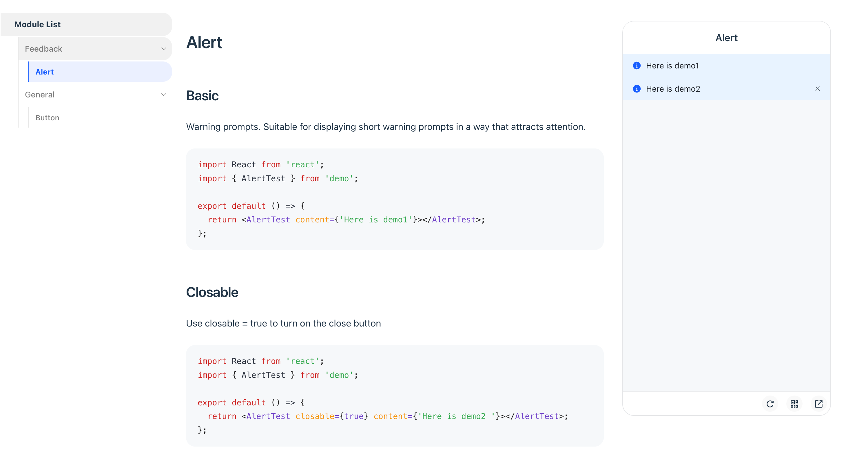
    This mode displays a fixed iframe preview area on the right side of the page, ideal for mobile component library documentation.

    Syntax:

    example.mdx
    ```tsx file="./_demo.tsx" preview="iframe-fixed"
    
    ```

    Rendering result:

    preEntry Tips

    You can inject global scripts or styles into the iframe preview environment using iframeOptions.builderConfig.source.preEntry. Here are some common use cases:

    • Mobile touch event emulation: Emulate mobile touch events on PC by importing @vant/touch-emulator.

    • Dark mode handling: Inject a MutationObserver to watch for html.dark class changes, then sync to body.dark or perform other dark mode processing.

    • Using Tailwind CSS: Since the iframe preview environment is a separate Rsbuild instance, if your previewed components depend on Tailwind CSS v4, configure @rsbuild/plugin-tailwindcss in iframeOptions.builderConfig.plugins and inject your Tailwind CSS entry via preEntry.

    rspress.config.ts
    import { pluginTailwindcss } from '@rsbuild/plugin-tailwindcss';
    
    pluginPreview({
      iframeOptions: {
        builderConfig: {
          plugins: [pluginTailwindcss()],
          source: {
            preEntry: [
              '@vant/touch-emulator',
              './src/dark-mode-observer.js',
              './tailwind.css',
            ],
          },
        },
      },
    });

    Options

    This plugin accepts a configuration object with the following type definition:

    interface PreviewOptions {
      defaultRenderMode?: 'pure' | 'preview';
      defaultPreviewMode?: 'internal' | 'iframe-fixed' | 'iframe-follow';
      iframeOptions?: IframeOptions;
      previewLanguages?: string[];
      previewCodeTransform?: (codeInfo: {
        language: string;
        code: string;
      }) => string;
    }
    
    interface IframeOptions {
      devPort?: number;
      builderConfig?: RsbuildConfig;
      customEntry?: (meta: CustomEntry) => string;;
    }

    defaultRenderMode

    • Type: 'pure' | 'preview'
    • Default: 'pure'

    Configures the default rendering behavior for code blocks that don't explicitly declare pure or preview.

    Warning

    It is not recommended to modify the default value, as it may affect the combined usage with @rspress/plugin-playground.

    • ```tsx pure: Render as a regular code block
    • ```tsx: Render based on defaultRenderMode configuration
    • ```tsx preview: Render as a code block with preview component

    defaultPreviewMode

    • Type: 'internal' | 'iframe-follow' | 'iframe-fixed'
    • Default: 'internal'

    Configures the default preview mode for ```tsx preview.

    • ```tsx preview: Render based on defaultPreviewMode configuration
    • ```tsx preview="internal": Render using internal mode
    • ```tsx preview="iframe-follow": Render using follow iframe mode
    • ```tsx preview="iframe-fixed": Render using fixed iframe mode

    iframeOptions

    This plugin starts a separate Rsbuild instance for the iframe mode's dev server and build process, completely isolated from the Rspress documentation compilation.

    iframeOptions.devPort

    • Type: number
    • Default: 7890

    Configures the dev server port for iframe preview. If the specified port is already occupied, the plugin will automatically try the next port, up to 20 attempts.

    iframeOptions.builderConfig

    Configures Rsbuild build options for the iframe, such as adding global styles or scripts.

    For example, to add Less or Sass support in previews, install and configure the corresponding Rsbuild plugin:

    npm
    yarn
    pnpm
    bun
    deno
    npm add @rsbuild/plugin-less -D
    rspress.config.ts
    import { defineConfig } from '@rspress/core';
    import { pluginPreview } from '@rspress/plugin-preview';
    import { pluginLess } from '@rsbuild/plugin-less';
    
    export default defineConfig({
      plugins: [
        pluginPreview({
          iframeOptions: {
            builderConfig: {
              plugins: [pluginLess()],
            },
          },
        }),
      ],
    });

    iframeOptions.customEntry

    Configures a custom entry to support other frameworks like Vue.

    Note

    Only available in preview="iframe-follow" mode.

    Here is an example for the Vue framework:

    import { defineConfig } from '@rspress/core';
    import { pluginPreview } from '@rspress/plugin-preview';
    import { pluginVue } from '@rsbuild/plugin-vue';
    
    export default defineConfig({
      // ...
      plugins: [
        pluginPreview({
          previewMode: 'iframe',
          previewLanguages: ['vue'],
          iframeOptions: {
            position: 'follow',
            customEntry: ({ demoPath }) => {
              return `
              import { createApp } from 'vue';
              import App from ${JSON.stringify(demoPath)};
              createApp(App).mount('#root');
              `;
            },
            builderConfig: {
              plugins: [pluginVue()],
            },
          },
        }),
      ],
    });

    previewLanguages

    • Type: string[]
    • Default: ['jsx', 'tsx']

    Configures the code languages that support preview. To support other formats like JSON or YAML, use this in conjunction with previewCodeTransform.

    previewCodeTransform

    • Type: (codeInfo: { language: string; code: string }) => string
    • Default: ({ code }) => code

    Performs custom transformation on code before preview.

    The following example shows how to transform JSON Schema into a renderable React component:

    {
      "type": "div",
      "children": "Render from JSON"
    }

    You can configure it as follows:

    pluginPreview({
      previewLanguages: ['jsx', 'tsx', 'json'],
      previewCodeTransform(codeInfo) {
        if (codeInfo.language === 'json') {
          return `
    import React from 'react';
    
    const json = ${codeInfo.code};
    
    export default function() {
    return React.createElement(json.type, null, json.children);
    }
    `;
        } else {
          return codeInfo.code;
        }
      },
    });

    Migrating from V1

    When migrating from Rspress V1, the plugin functionality remains unchanged. Only the MDX source code syntax has the following adjustments:

    • <code src="./foo.tsx"/> should be migrated to File Code Block ```tsx file="./foo.tsx"
    • The defaultPreviewMode option replaces iframeOptions.position and previewMode
    • The default value of defaultRenderMode changed from 'preview' to 'pure'
    • @rsbuild/plugin-less and @rsbuild/plugin-sass are no longer built-in. If you need Less or Sass support in previews, install the corresponding plugin and configure it via iframeOptions.builderConfig:
    npm
    yarn
    pnpm
    bun
    deno
    npm add @rsbuild/plugin-less -D
    rspress.config.ts
    import { defineConfig } from '@rspress/core';
    import { pluginPreview } from '@rspress/plugin-preview';
    import { pluginLess } from '@rsbuild/plugin-less';
    
    export default defineConfig({
      plugins: [
        pluginPreview({
          iframeOptions: {
            builderConfig: {
              plugins: [pluginLess()],
            },
          },
        }),
      ],
    });
    Migration Examples

    Example 1:

    Before: Required declarations in both config file and MDX file.

    pluginPreview({
      previewMode: 'iframe',
      iframeOptions: { position: 'fixed' },
    });
    ```tsx preview
    
    ```

    After: Only declare in the MDX file.

    ```tsx preview="iframe-fixed"
    
    ```

    Example 2:

    Before: Using iframe or previewMode="iframe" attribute.

    ```tsx iframe
    
    ```
    
    {/* or */}
    
    <code src="./_demo.tsx" previewMode="iframe" />

    After: Use the unified preview="..." attribute.

    ```tsx preview="iframe-follow"
    
    ```
    
    ```tsx file="./_demo.tsx" preview="iframe-follow"
    
    ```